Guides and reports
Revamp of the API credentials screens
By Beppe Catanese, Developer Advocate, Adyen

The Developer Experience team at Adyen has been busy with a significant redesign of the “API credentials” screens. This is the section of theCustomer Areawhere our merchants manage the configuration to enable access to the backend of the Adyen platform.
List screen
The “API Credentials” list is the entry point to the feature. The list of all (active and inactive) “API credentials” accounts are listed here, presenting the core attributes (username, account name, type of account).

From the landing page the user can perform two operations:
- create a new “API credentials” record
- edit existing credentials.
Create new API credentials
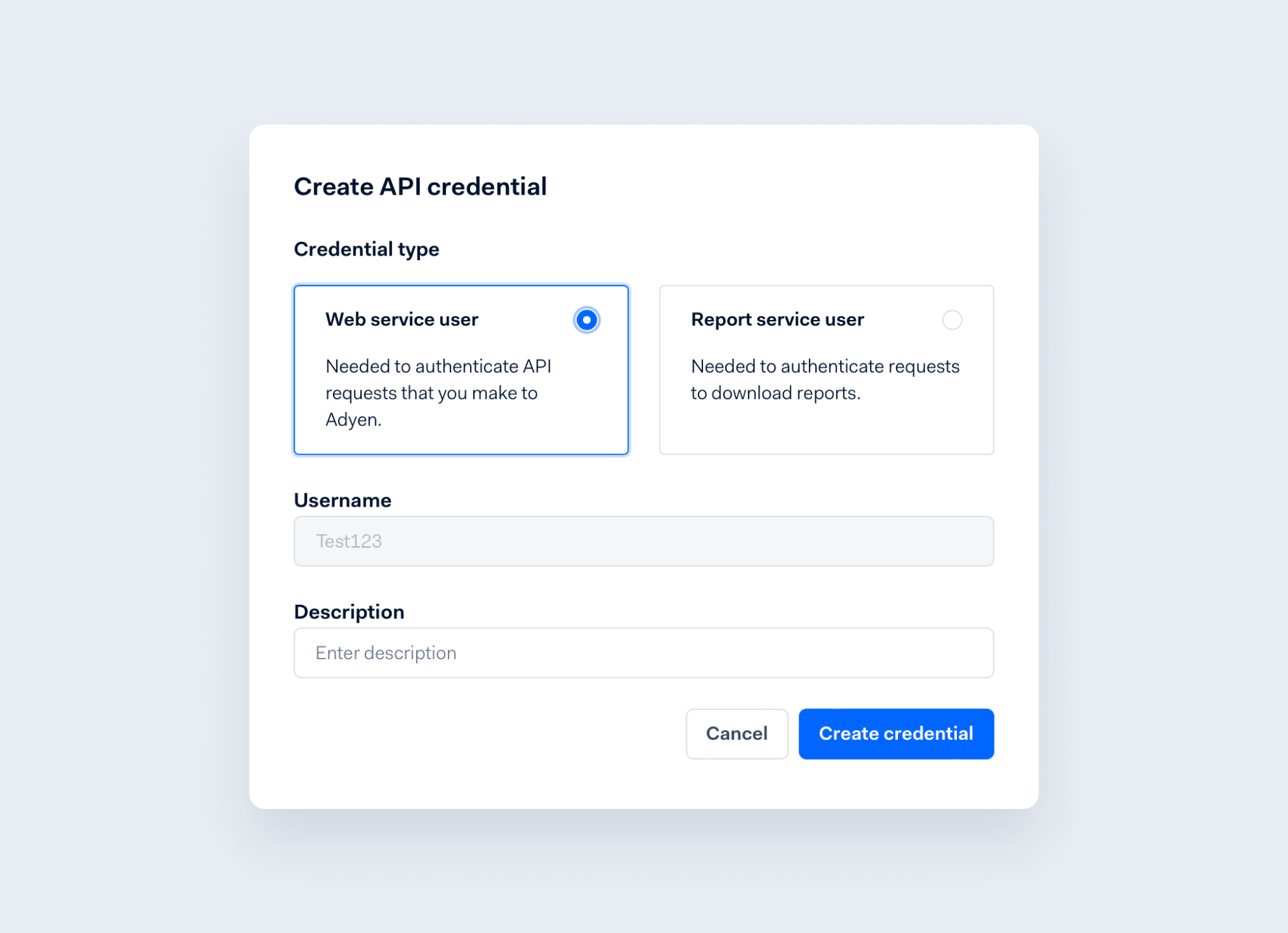
The Create screen has been redesigned to be concise and effective: during the creation the user must provide a minimum set of attributes. The username is always generated by the system.

Edit API credentials
The previous version of the screen was dense and busy, trying to fit several configuration settings and options in a classic web form. This was the outcome of a fast-growing platform continuously adding features and integration to support more customers and markets.
The new design focuses onkey usability principles(simplicity, consistency, self-explanatory) and re-organizes the screen around different contextual sections and several guidelines:
- prefer scrolling over an overloaded form
- adopt collapsable modules to “hide” what is not relevant
- ensure visible section titles with larger and cleaner fonts
- include built-in contextual help, for example adding informative text and displaying warnings next to labels or buttons.
Server Settings section
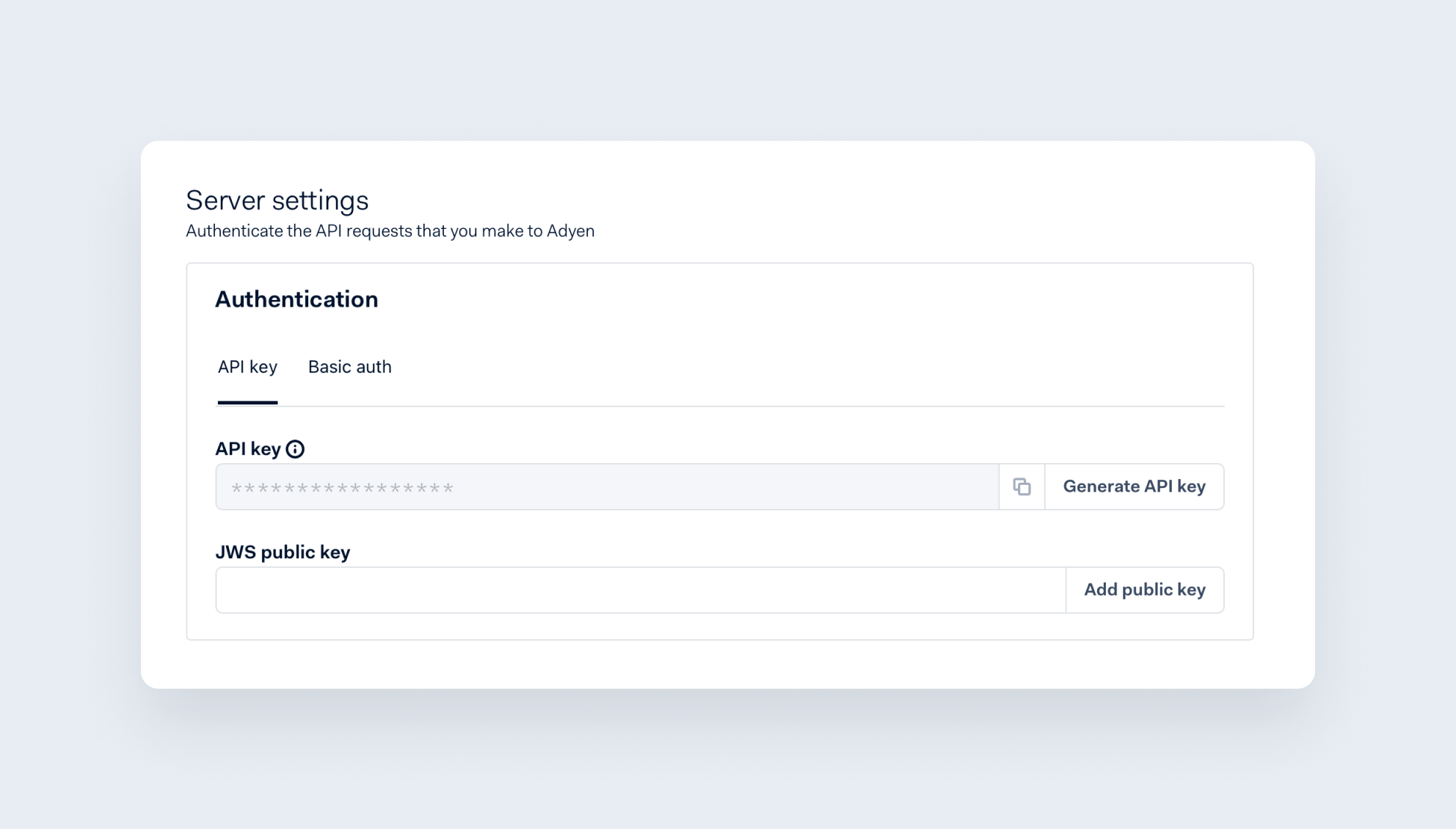
The authentication details (the most sensitive information) are found in the “Server Settings” section: the user can toggle between API key and Basic Authentication to define which authentication method must be implemented.

Client Settings
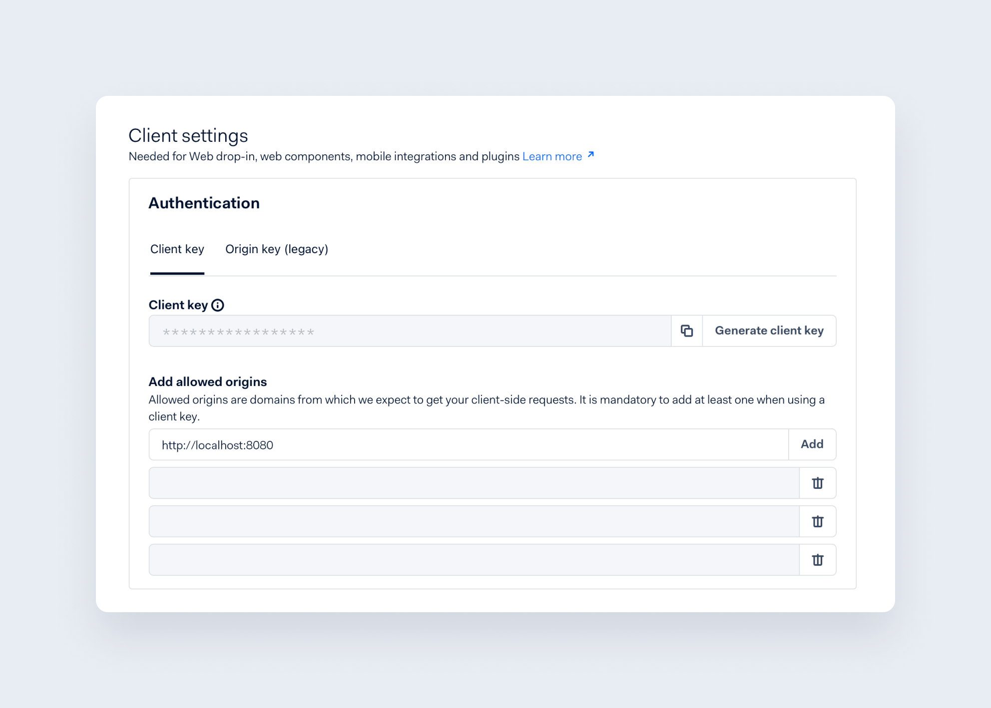
The client configuration, only necessary in the case of UI integrations (Drop-in, web components, native mobile integration, plugins), is part of the “Client Settings” section. The “Allowed Origins” list (i.e. hosts from which client-side requests can be originated) has also been redesigned. The hostnames are all clearly visible and it is easier to add/remove entries.

Roles and associated accounts
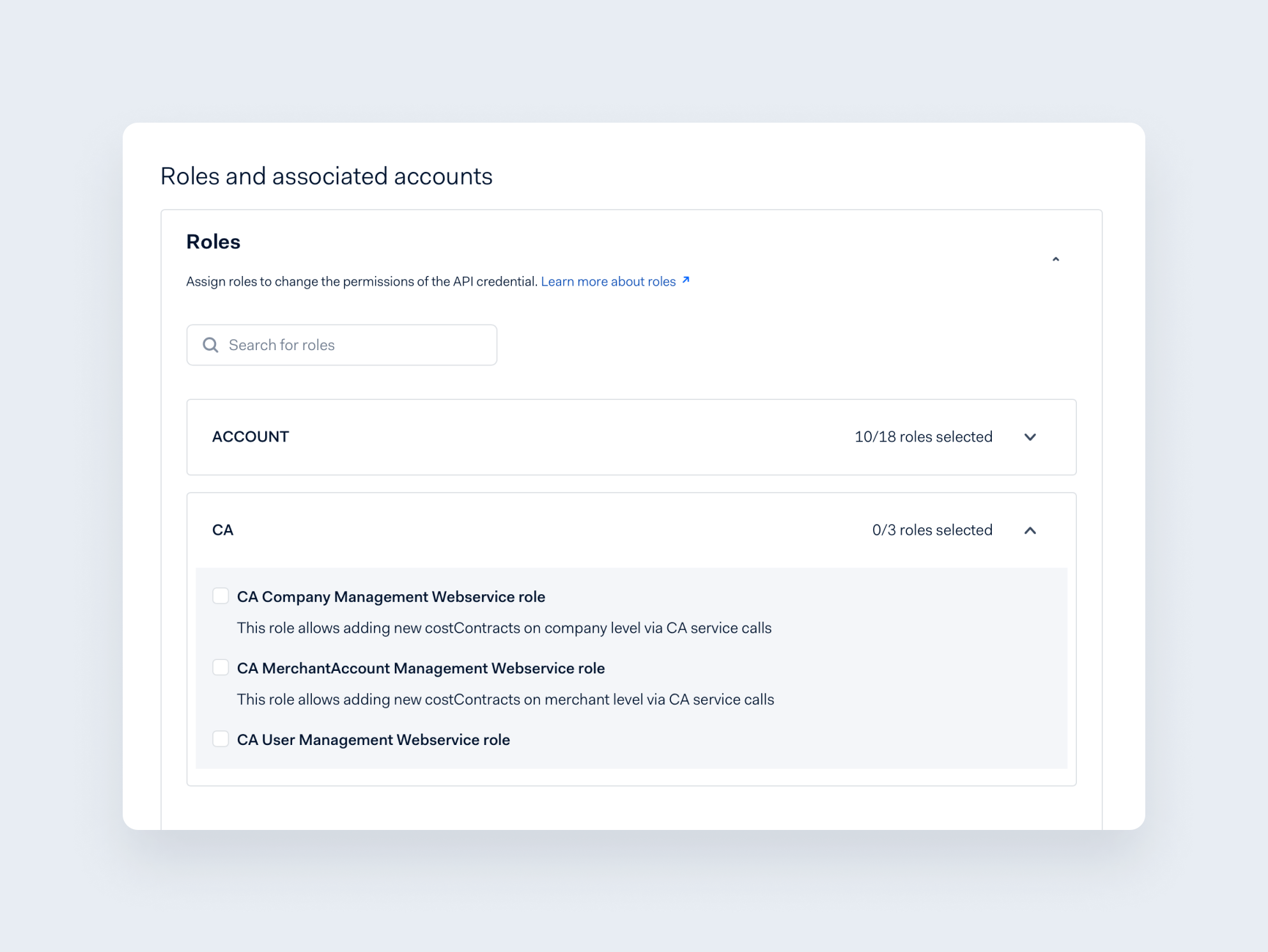
The most effective improvement is visible in the last section: the long scrollable list of roles has been replaced by collapsible accordions which group permissions based on their functional scope. Each heading provides a counter of how many roles are enabled (without the need to open it) and an over-edging search box allows filtering (cross section) by role name.

Final words
We are rolling out the new design through our test and live environments, always doing this incrementally to monitor the upgrades and intervene when something needs attention, while the DexEx team is already implementing new features of the Customer Area.
We are happy to hear your feedback about the new screens and any other suggestions that can make your user experience better and our platform closer to your needs and way of working. Get in touch with your Adyen point of contact or connect with us onTwitter.